1. Container 组件
Container 组件是 Flutter 中的布局组件,可以类比为 web 开发中的 div 标签。
它属于单一子组件的容器,接受一个 child 参数作为子组件, child 类型可以是任何 widget,包括其他的 Container 组件。
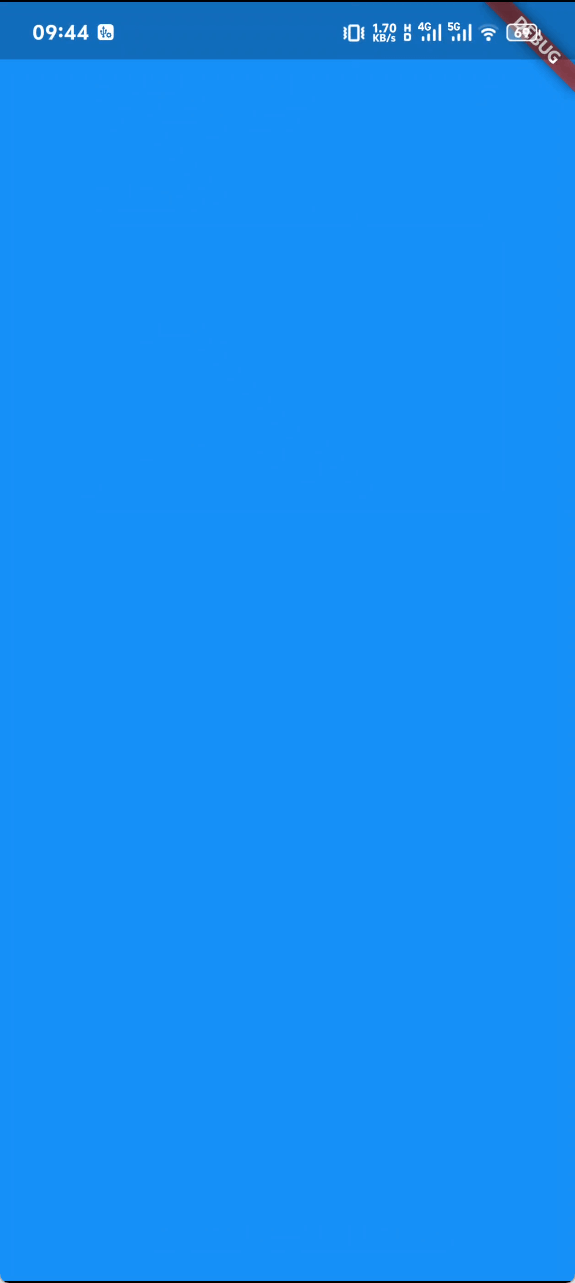
容器在没有子元素的情况下会尽量变得尽可能大,除非传入的约束条件是无界的,在这种情况下,它们会尽量变得尽可能小。
Container(
  decoration: BoxDecoration(
    color: Colors.blue,
  ),
)以上代码效果如下:
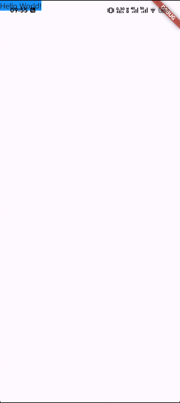
有子元素的容器会根据其子元素的大小来调整自身大小。
Container(
decoration: BoxDecoration(
color: Colors.blue,
),
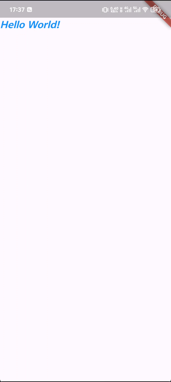
child: Text('Hello World!'),
),以上代码效果如下:
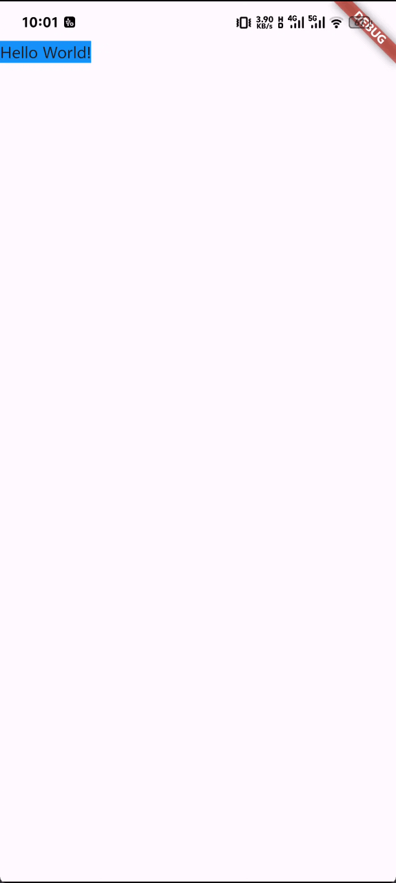
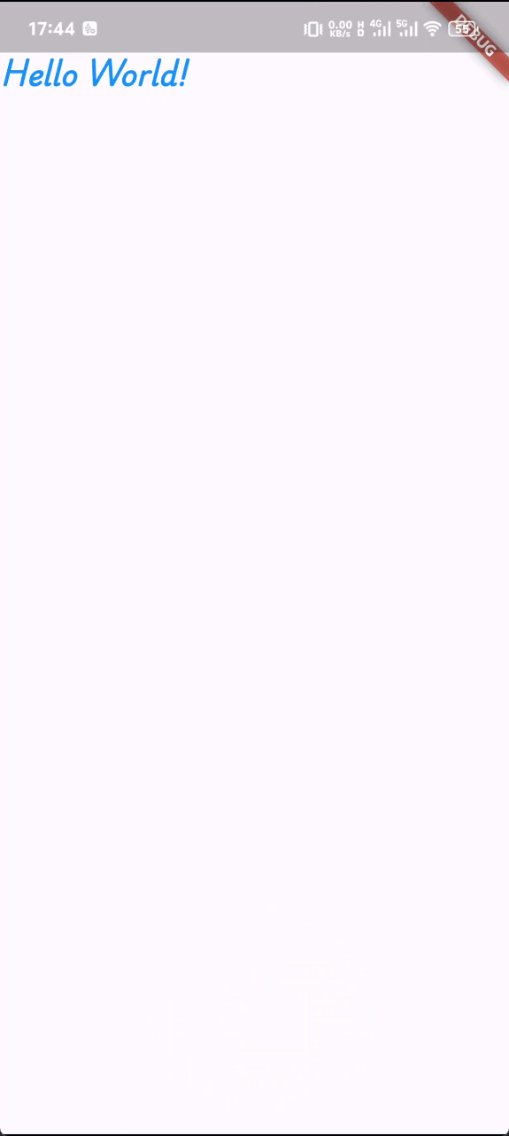
Tips: 如果你希望所有的元素都在安全区域展示,不被系统状态栏、导航栏等系统元素遮挡,可以使用 SafeArea 组件。
SafeArea(
  child: Container(
    decoration: BoxDecoration(
      color: Colors.blue,
    ),
    child: Text('Hello World!'),
  ),
)以上代码效果如下:
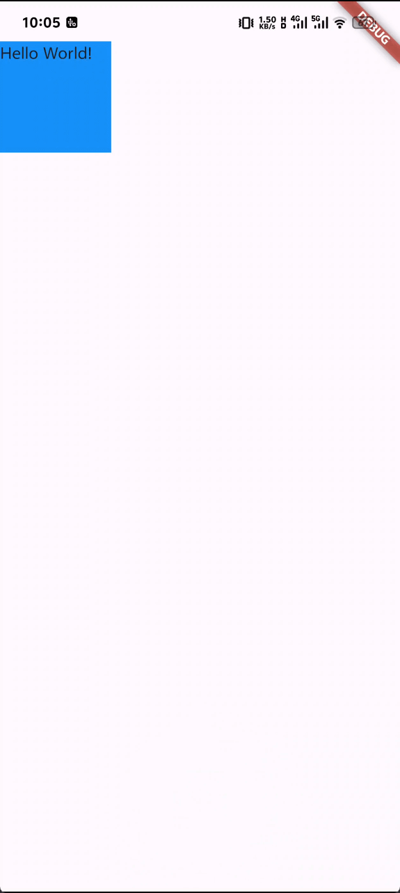
如果你给 Container 组件设置了 width 和 height,那么它将会按照你指定的尺寸而不是子组件的尺寸来进行布局。
SafeArea(
  child: Container(
    decoration: BoxDecoration(
      color: Colors.blue,
    ),
    width: 100,
    height: 100,
    child: Text('Hello World!'),
  ),
)以上代码效果如下:
1.1 关于外边距(magin)和内边距(padding)
container 组件可以通过 margin 和 padding 属性来设置外边距和内边距。(flutter 中外边距和内边距的概念等同于 web 开发中的 margin 和 padding)
生成内外边距的方法:
- EdgeInsets.all 生成四个方向上都相同的内外边距
- EdgeInsets.symmetric 按照水平或垂直方向生成内外边距
- EdgeInsets.fromLTRB 按照左、上、右、下四个方向生成内外边距
- EdgeInsets.only 按照指定方向生成内外边距
SafeArea(
  child: Container(
    // margin: EdgeInsets.all(10),
    // padding: EdgeInsets.symmetric(horizontal: 20, vertical: 10),
    margin: const EdgeInsets.fromLTRB(10, 10, 10, 10),
    padding:
        const EdgeInsets.only(left: 20, top: 10, right: 20, bottom: 10),
    decoration: const BoxDecoration(
      color: Colors.blue,
    ),
    width: 100,
    height: 100,
    child: const Text('Hello World!'),
  ),
),2. Rows 和 Columns 组件
Rows 和 Columns 组件同样是 Flutter 中的布局组件,可以类比为 web 开发中的 flex 布局。
它们都属于多子组件的容器,接受多个 child 参数作为子组件,入口参数为children, children 指定的子组件类型可以是任何 widget 或 widget 集合,包括其他的 Rows 和 Columns 组件。
SafeArea(
  child: Column(
    children: [
      Container(
        decoration: const BoxDecoration(
          color: Colors.blue,
        ),
        width: 100,
        height: 100,
        child: const Text('Hello World!'),
      ),
      Container(
        decoration: const BoxDecoration(
          color: Colors.yellow,
        ),
        width: 100,
        height: 100,
        child: const Text('Hello World!'),
      ),
      Container(
        decoration: const BoxDecoration(
          color: Colors.green,
        ),
        width: 100,
        height: 100,
        child: const Text('Hello World!'),
      ),
    ],
  ),
),以上代码效果如下:
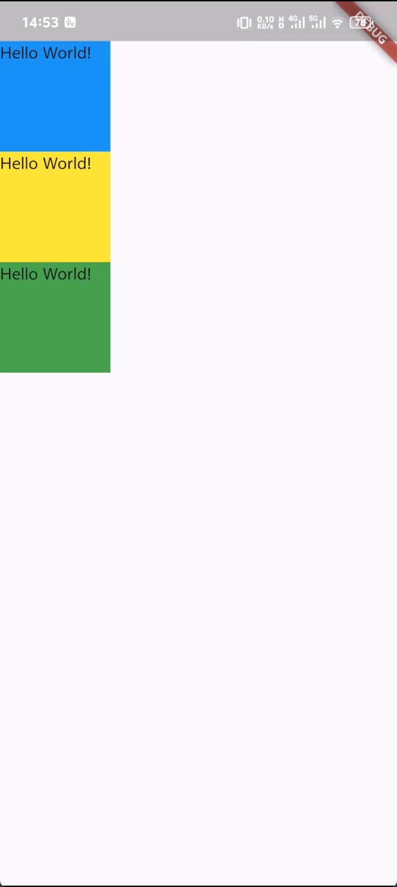
Columns 组件总是会在垂直方向上尽可能的占用空间,而 Rows 组件总是在水平方向上尽可能的占用空间。
如图所示:
如果你希望更改这个默认行为,可以通过更改 mainAxisSize 属性来控制 Rows 和 Columns 组件在主轴方向上的尺寸分配。
dartColumn( mainAxisSize: MainAxisSize.min, )
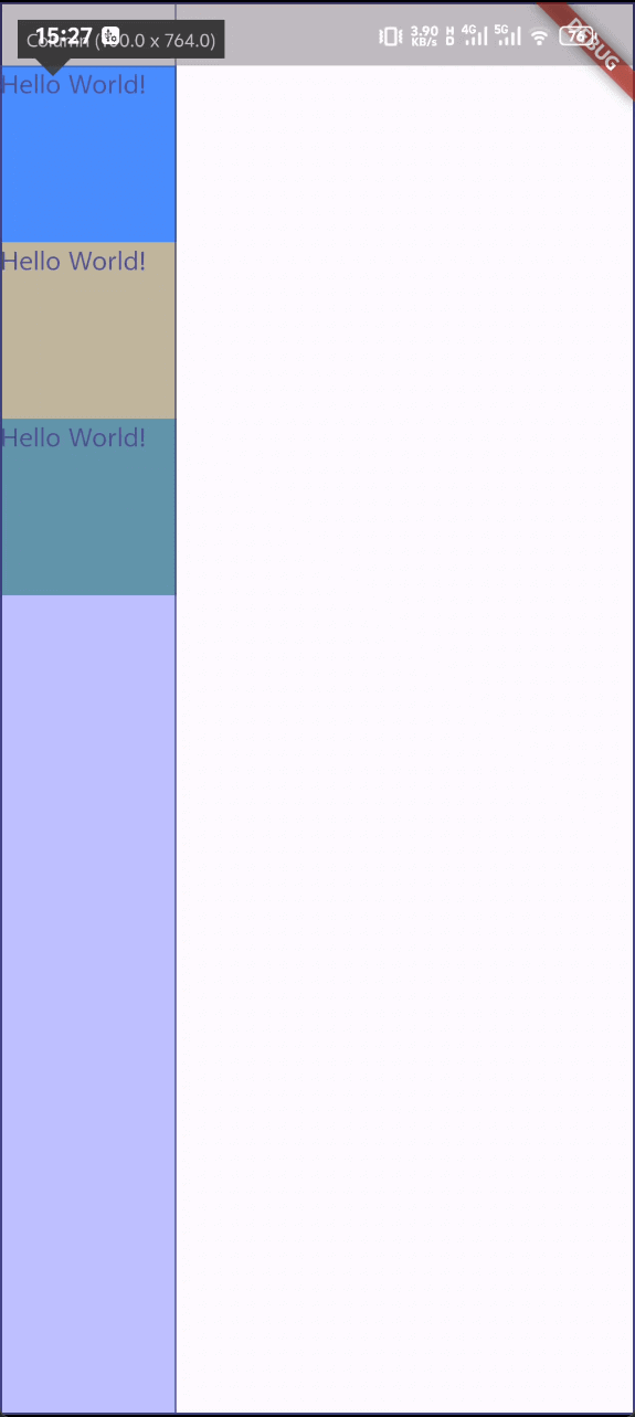
另外,Columns 组件还可以设置 verticalDirection 属性来控制子组件的排列方向。
SafeArea(
  child: Column(
    // mainAxisSize: MainAxisSize.min,
    verticalDirection: VerticalDirection.up,
    children: [
      Container(
        decoration: const BoxDecoration(
          color: Colors.blue,
        ),
        width: 100,
        height: 100,
        child: const Text('Hello World!'),
      ),
      Container(
        decoration: const BoxDecoration(
          color: Colors.yellow,
        ),
        width: 100,
        height: 100,
        child: const Text('Hello World!'),
      ),
      Container(
        decoration: const BoxDecoration(
          color: Colors.green,
        ),
        width: 100,
        height: 100,
        child: const Text('Hello World!'),
      ),
    ],
  ),
)以上代码效果如下:
以及,通过 mainAxisAlignment 属性来控制子组件在主轴方向上的对齐方式,有效的值有:
- MainAxisAlignment.start
- MainAxisAlignment.end
- MainAxisAlignment.center
- MainAxisAlignment.spaceBetween
- MainAxisAlignment.spaceAround
- MainAxisAlignment.spaceEvenly 子组件间距均匀分布
通过 crossAxisAlignment 属性来控制子组件在交叉轴方向上的对齐方式,有效的值有:
- CrossAxisAlignment.start
- CrossAxisAlignment.end
- CrossAxisAlignment.center
- CrossAxisAlignment.stretch 拉伸子组件,占满交叉轴方向的全部空间
- CrossAxisAlignment.baseline
这些基本上和 web 开发中的 flex 布局的概念是一致的, mainAxisAlignment 和 crossAxisAlignment 也和 justify-content 和 align-items 相对应
3. Image 组件与图片导入
Image 组件是 Flutter 中的图片组件,用来展示图片。
它提供多种构造函数,用于指定加载图像的多种方式:
- Image.asset 加载本地资源图片
- Image.network 加载网络图片
- Image.file 加载本地文件图片
Image 组件支持的图片格式有: JPEG, PNG, GIF, Animated GIF, WebP, Animated WebP, BMP, and WBMP。
在默认的构造函数中,通过image参数传入一个指定的ImageProvider类型的值,就可以加载指定的图片。
ImageProvider 是一个抽象类,用于提供图片资源。常见的 ImageProvider 类型有 AssetImage、NetworkImage、FileImage 等。
 Image(
  image: AssetImage('assets/images/xxx.png'),
  width: 100,
  height: 100,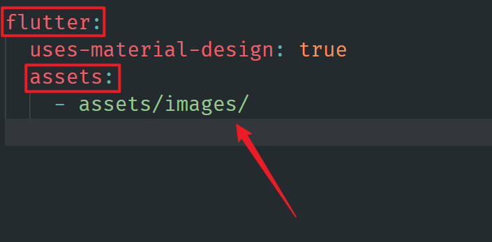
),需要注意的是,在使用
AssetImage类型的ImageProvider时,需要先在 pubspec.yaml 文件中配置图片资源路径来导入图片资源。
4. Text 组件与自定义字体
Text 组件是 Flutter 中的文本组件,用来展示文本。
通过指定style参数,可以设置文本的字体大小、颜色、粗细、斜体等样式。查看更多样式设置
Text(
  'Hello World!',
  style: TextStyle(
    fontSize: 20,
    color: Colors.blue,
    fontWeight: FontWeight.bold,
    fontStyle: FontStyle.italic,
  ),
),以上代码效果如下:
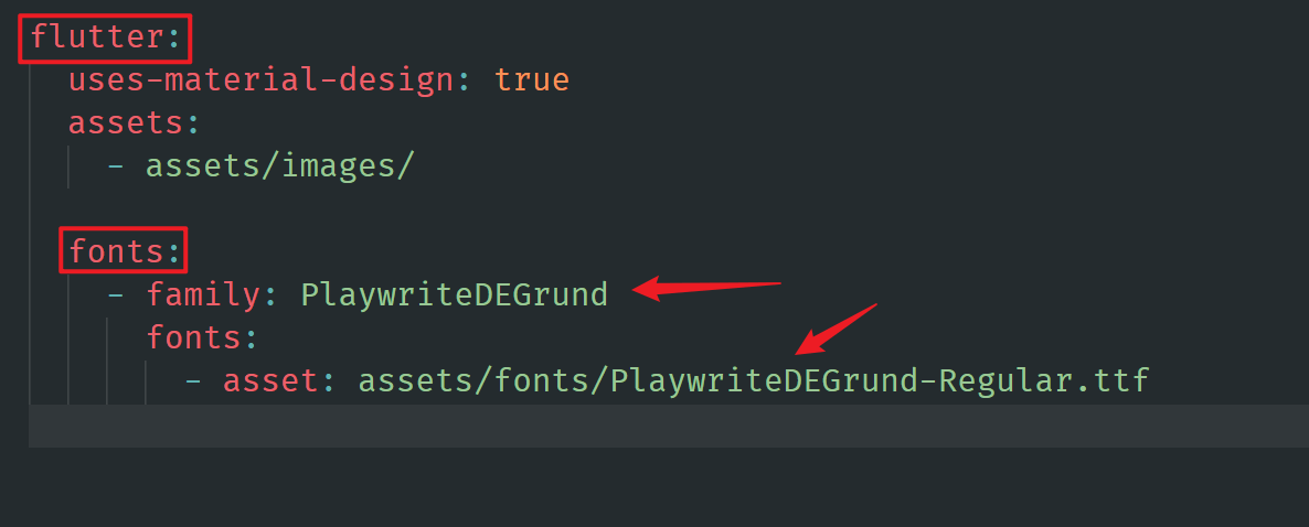
4.1 自定义字体
Flutter 支持自定义字体,通过 fontFamily 参数指定字体名称,就可以使用该字体渲染文本。
const Text(
  'Hello World!',
  style: TextStyle(
    fontSize: 20,
    color: Colors.blue,
    fontWeight: FontWeight.bold,
    fontStyle: FontStyle.italic,
    fontFamily: 'PlaywriteDEGrund',
  ),
),以上代码效果如下:
需要注意的是,自定义字体同样需要在 pubspec.yaml 文件中配置和导入。
5. Icon 组件
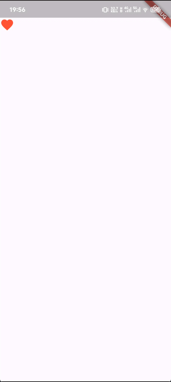
Icon 组件是 Flutter 中的图标组件,用来展示具体的图标类型。
通常的做法是通过指定 flutter 中预定义的 material IconData 枚举值来展示具体的图标。查看所有图标类型
Icon(
  Icons.favorite,
  size: 30,
  color: Colors.red,
),以上代码效果如下:
6. Expanded 组件
Expanded 组件同样是 Flutter 中的布局组件,它可以用来扩展其子组件的尺寸。
使用 Expanded 组件可以使 Row、Column 或 Flex 布局的子元素沿着主轴扩展以填充可用空间(例如,对于 Row 是水平扩展,对于 Column 是垂直扩展)。如果有多个子元素扩展,可用空间将根据弹性因子flex按比例在它们之间进行分配。
注意: Expanded 组件只能作为 Row、Column 或 Flex 布局的子元素使用。
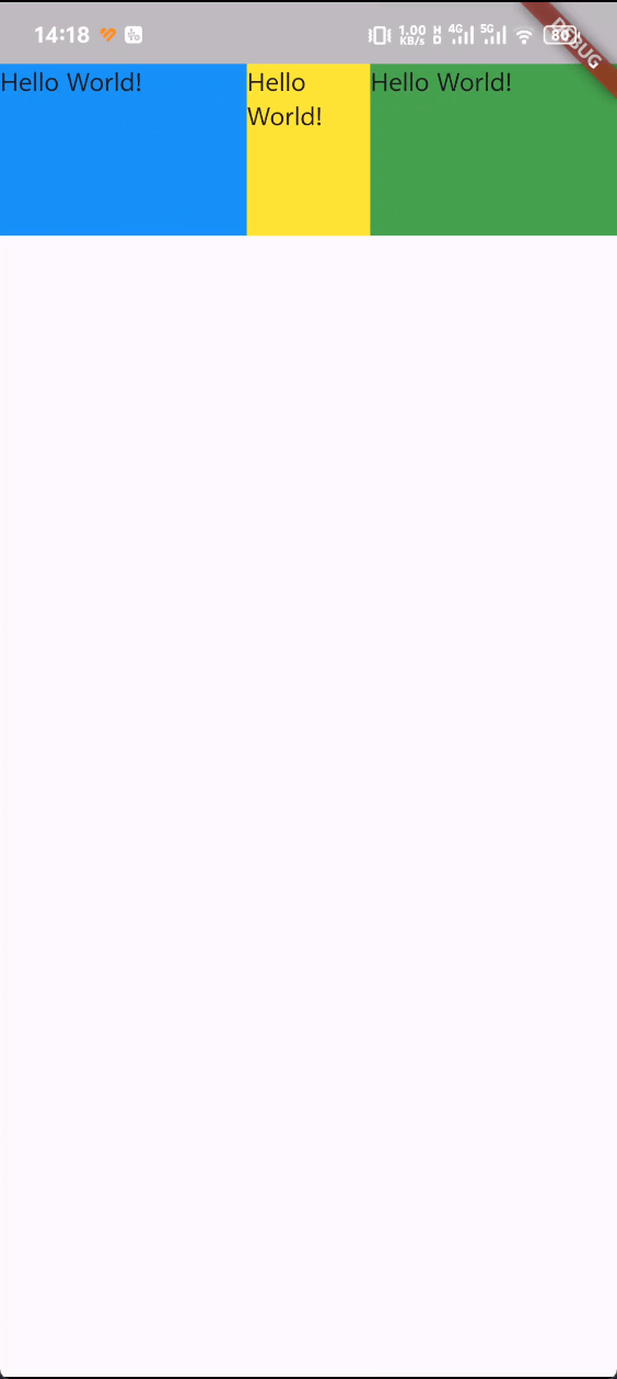
Row(
  children: [
    Expanded(
      flex: 2, // 比例因子
      child: Container(
        decoration: BoxDecoration(
          color: Colors.blue,
        ),
        width: 100, // 这里设置的宽度不会生效
        height: 100,
        child: Text('Hello World!'),
      ),
    ),
    Expanded(
      child: Container(
        decoration: BoxDecoration(
          color: Colors.yellow,
        ),
        width: 100, // 这里设置的宽度不会生效
        height: 100,
        child: Text('Hello World!'),
      ),
    ),
    Expanded(
      flex: 2, // 比例因子
      child: Container(
        decoration: BoxDecoration(
          color: Colors.green,
        ),
        width: 100, // 这里设置的宽度不会生效
        height: 100,
        child: Text('Hello World!'),
      ),
    ),
  ],
),以上代码效果如下:
7. Padding 组件
Padding 组件也是 Flutter 中的布局组件之一,用来给父组件添加内边距。
它接受一个 padding 参数,该参数是一个EdgeInsetsGeometry类型的值,用来设置四个方向上的内边距。
具体用法和 Container 组件中的 padding 属性类似。回到 1.1
Padding(
  padding: const EdgeInsets.all(20),
  child: Container(
    decoration: BoxDecoration(
      color: Colors.blue,
    ),
    width: 100,
    height: 100,
    child: Text('Hello World!'),
  ),
),